Getting started
DesignPresso is a studio where product-design work happens on a single canvas. There are only three surfaces: the node canvas in the middle, a work panel on the left, and the AI agent chat on the right. Sign in, create a canvas, and you're working.
The top bar holds the project switcher, the save indicator and save points, Run (▶), undo/redo, Share, a plan badge, your credit balance, notifications, and the account menu. Two view switches sit at its far right: 'Focus the main design' (which swaps between the node canvas and Focus view) and collapse/show chat. The thin icon rail on the left opens and closes work panels, the middle is the node canvas, and the entire right column is the AI agent chat.
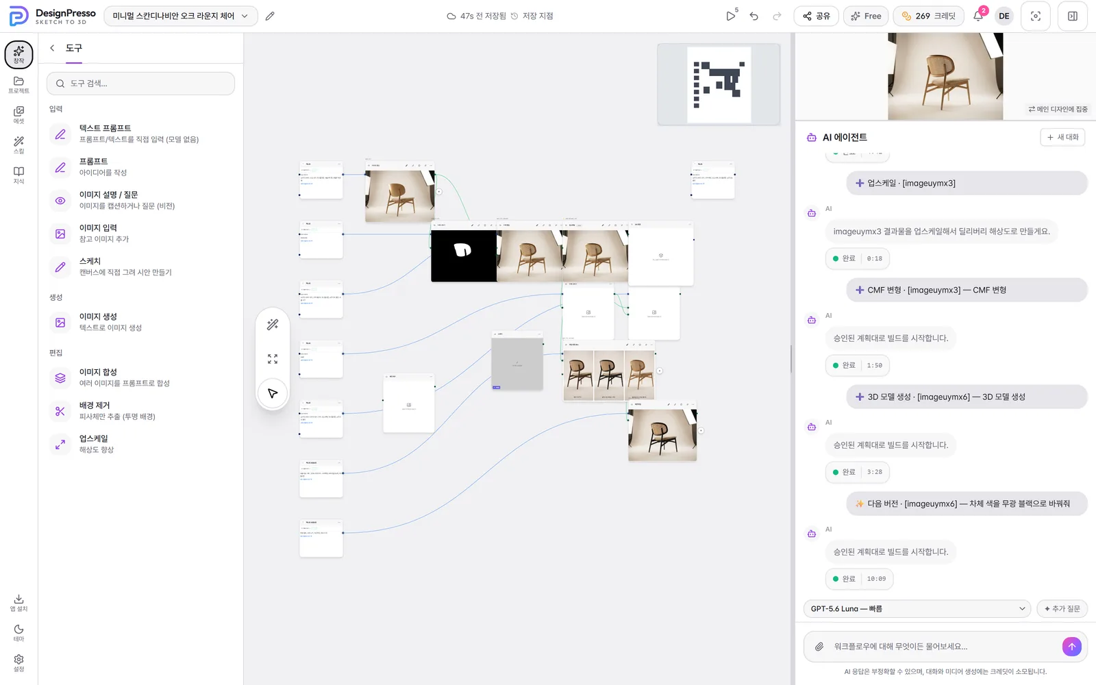
Enter the studio and make your first canvas
- 1
Sign in and onboard
Sign in from a desktop browser and the studio loads. First-time users pick a nickname (there's a randomize button) and answer a short survey; accounts that skipped the signup form — social logins, for instance — confirm terms and age here too.
- 2
Claim your welcome credits
Saving your onboarding answers triggers a 🎉 celebration that hands you your signup credits. Click through and you land straight in the workspace.
- 3
Create a canvas
Click the current canvas name (chevron) in the top bar to open the list and choose 'New canvas' at the bottom, or open the Projects panel from the left rail and use 'New canvas' at its foot. The name is optional.
- 4
Set the image ratio
You set the ratio while you work, not when you create the canvas. Say 'portrait', 'square', or '9:16' in your request and it's honored, and nodes that expose a ratio control let you pick one directly. Say nothing and the default applies — except reference sheets that pack several shots into one image, which stay 16:9 regardless of the project's ratio.
- 5
Start from a start card
An empty canvas offers start cards, split by what you already have: start from an idea (a few questions become a brief, then two or three genuinely different concepts), start from a sketch (a photoreal render that holds your drawing's form), or start from a product photo (next versions, material comparisons, and presentation shots built off that photo). Picking one opens a short intake — you answer mostly by tapping chips — and the last step shows the estimated credits and time before anything runs. Close it midway and your answers are kept so you can resume.
- 6
Or just type in the chat
You don't have to use a card. Just describe what you want in the chat on the right — "work up a concept for a folding camping lantern", "render this sketch". If you have a sketch or reference photo, drag the file onto the chat composer; on send it also drops onto the canvas as an input node.
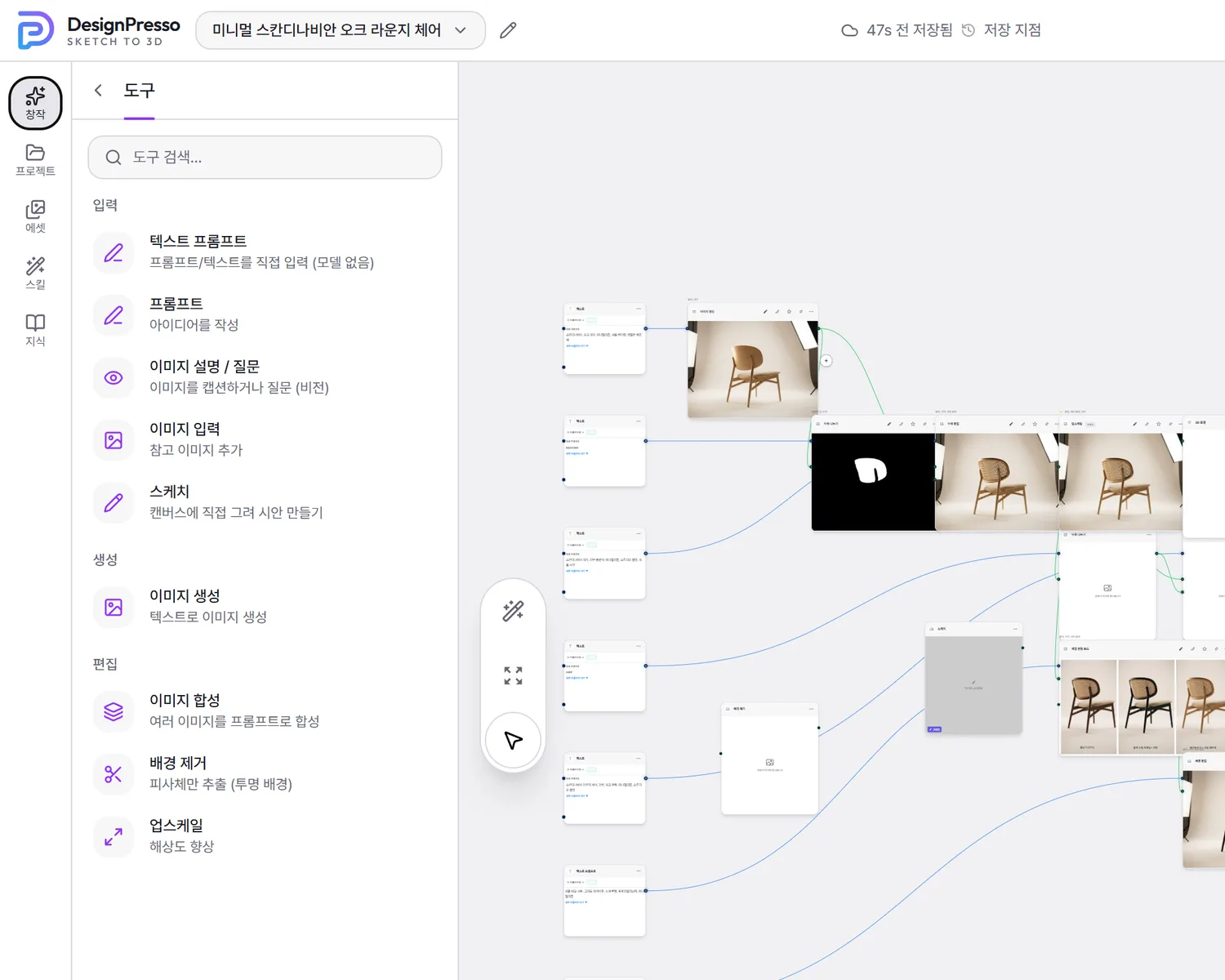
The left icon rail
- ✨ Create — the input, generation, and edit tools you drop on the canvas; open by default.
- 📁 Projects — switch, search, rename, and delete canvases, sort them into folders, and move one into the team space.
- 🖼 Assets — your generated results and uploaded files.
- 🪄 Skills — skill nodes you drop on the canvas and run yourself.
- 📖 Knowledge — the design-methodology lenses the agent applies to your work.
- At the bottom: Team (only when you administer one), Install app, Theme, and Settings.
Browser and device
The studio needs an up-to-date desktop Chrome or Edge — it checks for WebGPU, WebCodecs, and cross-origin isolation. On a device that doesn't qualify you're offered a chat-first mobile view instead, where you can talk things through with the agent and review results, while creating and running canvas nodes stays on the desktop studio. On an iPad the studio opens normally, and 'Install app' in the rail puts it on the home screen like a native app (outside Safari it walks you through Share → Add to Home Screen).
Credits and models
Every image generation and edit spends credits. Your live balance sits at the top-right next to the plan badge — click either to open Billing. New accounts get a signup bonus, and you'll see a top-up prompt when the balance runs low. Which model handles a request is decided server-side from what you asked for: there is no model picker, and you don't need one.
Handy to know
- Re-click an open rail icon to collapse the left panel and widen the canvas; the '<' at the left of a panel header does the same.
- Leave a new canvas unnamed and it auto-numbers to 'New canvas N'. Rename it anytime with the pencil icon in the top bar.
- The theme defaults to light regardless of your OS setting — this is a tool for making things on white paper. Switch to dark from the rail's Theme button if you prefer; the choice is remembered for this browser only.
- Drag the thin divider between the canvas and the chat to resize the chat column; the width is remembered next time.
AI agent chat
The AI agent panel docked on the right is how you mostly drive this product. Say what you want in plain language; the agent reads your current canvas and selection, then either talks it through or actually builds nodes, wires them together, and runs the generations — on exactly the same credit-metered path a manual click uses.
The core flow
- 1
Type your request
Write what you want in the composer at the bottom of the panel and send with Enter or the up-arrow (↑) button; Shift+Enter makes a new line. While typing Korean, Enter only commits the character rather than sending. Pure conversation — questions, discussing direction — just gets a reply and generates nothing.
- 2
Ask for a plan first when you want one
An instruction builds immediately — there is no approval step. If you want to review before anything runs, say "show me the plan first": the agent posts a plan card with what it will make, how many nodes, and the estimated credits. 'Yes, generate' runs it, 'Stop' cancels, and 'Modify' moves your cursor into the composer so you can say what to change and get a fresh proposal.
- 3
Attach references and set their role
Click the paperclip in the composer or drag files onto it to attach sketches, product photos, material swatches, or documents. Each image gets a role chip — reference or work on this — and reference is the default: someone else's product shot or a moodboard scrap becoming "the thing you're making" would quietly point later edits at that photo. Switch it to 'work on this' when you do mean to develop that image. On send, images also drop onto the canvas as input nodes while documents feed the project brief.
- 4
Watch it build
From one message the agent can create several nodes, connect them, and run them in order, with a 'Thinking…' bubble and stage label while it works. Generation progress, completion, and failures show directly on the canvas nodes. Long jobs are built in batches rather than all at once — say '계속' (continue) or use the offered button to move to the next batch.
Buttons instead of typing
- Approve / Modify / Not now buttons under any reply that ends by asking whether to continue. 'Not now' drops the idea and tells the agent not to ask again.
- 'Yes, generate' / 'Stop' / 'Modify' on a plan card.
- When the agent proposes several options — concept directions, for instance — click the card you like. Your pick becomes the reference for everything downstream.
- The full-width 'Continue ▸' button that appears when the agent pauses itself.
Other controls
- Translation: messages written in a language other than your app language are auto-translated into yours, with a toggle under the message to see the original. In a shared project each person reads the same thread in their own language.
- New chat, Stop, queue: 'New chat' at the top-right clears the conversation and stops any in-flight run; while the agent works, the send button becomes a Stop (■). In a shared project everyone's messages are handled one at a time.
- The Run (▶) button in the top bar: it doesn't advance the conversation, but it re-runs any node left pending or failed in dependency order, which revives a build that stalled.
- How hard it thinks: the selector above the composer picks fast / balanced / deep reasoning for the agent. Fast is the default; raise it only when the build is genuinely complicated. Deep reasoning unlocks on Pro and above. This affects the agent's thinking only — it has nothing to do with which model draws your images.
- Follow-up questions: the toggle on the same row makes the agent surface intent-narrowing questions and expansion ideas as a card before it builds. Turning it off doesn't make the agent read you less carefully — it only decides whether those question cards appear.
Select the target node before you type and the agent treats that selection as the subject of the request — a short "make just the handle wood" then can't be misread. With several results on the canvas and nothing selected, the agent will ask which one you mean.
An instruction runs immediately — if you want to review the work and its cost first, say "show me the plan first" to get a plan card. Documents and text files never land on the canvas (only images do); they go into the project brief. On a canvas shared with you as view-only you can read the thread and its translations, but you can't type, attach, approve, or run.
From sketch to render
The default progression in DesignPresso is brief → concept → lock → develop. The agent is built to hold that order, so it won't dump ten renders on you before you've even decided what the product is.
How it progresses
- 1
Brief — what, and for whom
Purpose, who uses it, the direction of the form, and any hard constraints. If something's missing the agent asks one or two short questions rather than running a full interview.
- 2
Concept — get distinct options and pick one
You get two or three concept cards, each with a genuinely different form language — three renders that differ only in color aren't options, and the agent is built to know that. Click the one you want and it proceeds with that.
- 3
Lock — pin the product to one sentence
The chosen concept gets locked into one sentence covering its color, material, finish, and signature form. That exact sentence is reused verbatim in every later prompt, which is what keeps it looking like the same product from shot to shot.
- 4
Develop — angles, materials, sheets
See the locked product from more angles, compare material candidates, and write the settled CMF onto a board. Through this stage only one variable changes at a time — if the angle shifts while you're comparing materials, the comparison stops meaning anything.
Sketch to render
If you have a hand sketch or line drawing, upload it in the chat and ask for a render. Don't re-describe the form in words — the sketch already supplies it, and saying it twice makes the two fight and blurs the result. Describe material, finish, lighting, and background instead. The agent reads heavy lines as silhouette, thin lines as part splits, and hatching as curvature, fills unfinished areas conservatively, and tells you what it assumed.
Drawing straight on the canvas
- 1
Draw on an empty sketch node
Instead of uploading a file you can draw right on the canvas: the Sketch tool in the Create panel opens a blank sheet with a small toolbar for pencil, eraser, color, width, and undo. The default tool is a pressure-sensitive pencil, and the eraser rubs out what it passes over rather than deleting whole strokes. On a tablet it's built for pen input (Apple Pencil and friends), so a resting palm leaves no marks; the hand icon in the toolbar switches between pen-only and finger drawing.
- 2
Draw over a render you already have
Tap the pencil icon at the top of a result node (or draw-over in its … menu) to mark up that image directly — a way to give instructions that are awkward to put into words, like "cut it back to this line".
- 3
Finish and it becomes a node
Finishing turns the drawing into an image node you can wire up like any other. The strokes are kept, so you can reopen it later and keep drawing.
How closely to follow the sketch
- Loose — the sketch is a direction and the render tidies the form. Good early on, or when the sketch is rough. Saying "something like this" lands here.
- Strict — the silhouette and proportions are pinned to the sketch. Right when proportions are already decided or the drawing is near-technical. Saying "exactly this shape" lands here.
Re-shooting a render
To change only the lighting or angle of a design you already have, just ask for it to be re-shot. Only camera, lighting, and background change; the product's shape, color, and materials stay locked to the reference. Angles run from a three-quarter hero through front, side, top-down, and detail macro, and the material picks the lighting: soft three-point for matte plastic and wood, a large soft key for metal and gloss, backlight for glass and translucents, and a grazing light when you want brushed grain or leather pores to read.
Material comparison and sheets that organize the work
- Material comparison (separate images) — the same product across several materials or colorways, each rendered as its own complete image with the angle, lighting, and background held fixed. They aren't packed into one panel sheet for a simple reason: the option you like has to be usable as the source of your next step. List up to four materials separated by commas; only as many as you list get made, and only those cost credits.
- CMF board — closer to a spec document, made once decisions are settled: a hero render plus per-part callouts naming the color (with its HEX), the material, and the finish. Every swatch sits under the same light so the finishes are actually comparable.
- Three-view sheet — front, side, and top on one canvas as straight orthographic projections, all at the same scale on a shared baseline with no perspective, so it reads as a drawing. If you know the dimensions, ask for them to be annotated.
What comes next
That's the image stage. Once one option wins, make it your main design and keep working on it in Focus view (next section); when only one part needs to change, go through part editing; and when the form is settled, carry it into 3D and CAD.
What makes a prompt land
Describe the mechanism, not the label. "Anodized aluminum" is a label; "a translucent oxide layer over metallic sheen, slightly darker at the edges" is a mechanism. Intent adjectives like "premium" get filled in with the model's own clichés unless you break them into three or four visual facts — "rugged" becomes exposed bolts, a heavy chamfer, overmolded impact corners, and a low wide stance. And a color name alone gives you a different color every time: give the HEX.
Asking to remake the whole thing and asking to fix one part give completely different results. A part-scoped request like "make just the handle leather" needs to go down the part-editing path for the rest to survive untouched — see the next section. Conversely, if you want to restyle the entire product in a new direction, just say so plainly.
The main design and Focus view
As options pile up on the canvas, "so what is the product right now?" gets blurry. DesignPresso pins that answer down: mark one image as the main design, and Focus view puts just that image on the whole screen, where you mark it up with a pen and make the next version. This is the loop you'll spend most of your time in.
Set the main design and push it forward
- 1
Make one image the main design
Press 📌 (pin as main) at the top of an image node and that option becomes the main design. Your first result is pinned automatically, and from then on the pin follows any new result built from the main — so it keeps pointing at the latest product without you touching it. You only press it yourself when you want to walk a branch back.
- 2
Open Focus view
'Focus the main design' at the top right replaces the node canvas with that single image, filling the screen. The same button becomes 'Back to node canvas' whenever you want the graph again. With no main design yet the button is disabled and tells you what to do first.
- 3
Mark up the image itself
[Draw] in the toolbar below lets you draw straight onto the image you're looking at — the way to give directions that are awkward in words: "take the backrest to this line", "curve the legs like this". Your strokes are read as the target geometry, not a vague hint, and the pen marks are removed from the result.
- 4
Run [Next version]
[+ Next version] opens a 'revision requirements' box. Write a line or two about what should change, press Create, and you get a new version edited from the main. Text alone, a drawn markup alone, or both together all work. The credits this will cost are shown right under the button before you press it.
- 5
Compare with the previous one
[Compare] shows the previous version only while you hold it down and snaps back the moment you let go. It's a hold rather than a toggle because judging a change is something you do by flicking back and forth. On a first result there's nothing to compare with, so the button doesn't appear.
- 6
Move between versions
The strip along the bottom lays this design's lineage out oldest-first. Click a thumbnail and the main design moves to that version; points where the history forks carry a branch badge. If an automatic pin move wasn't what you wanted, you can undo it from the same strip.
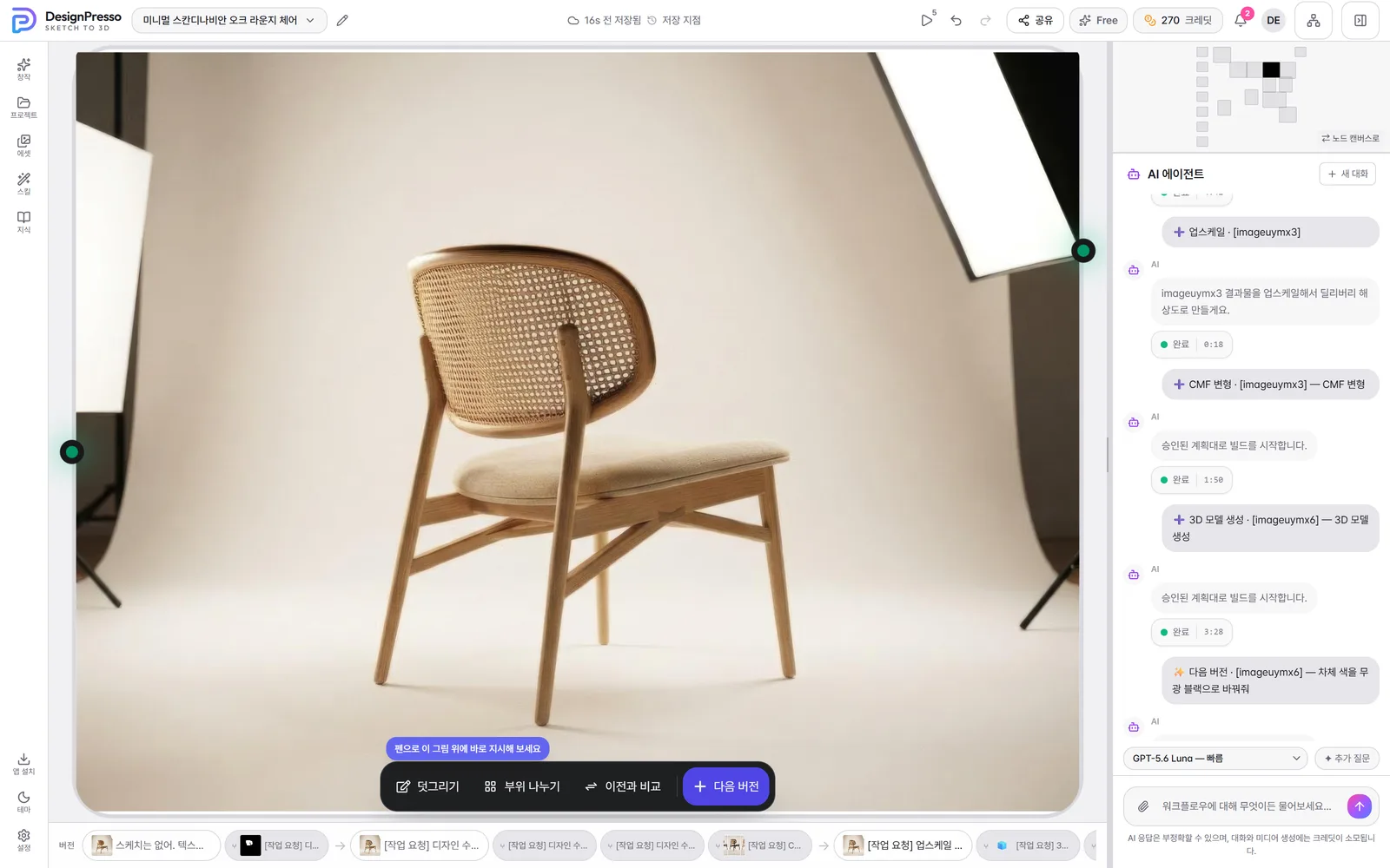
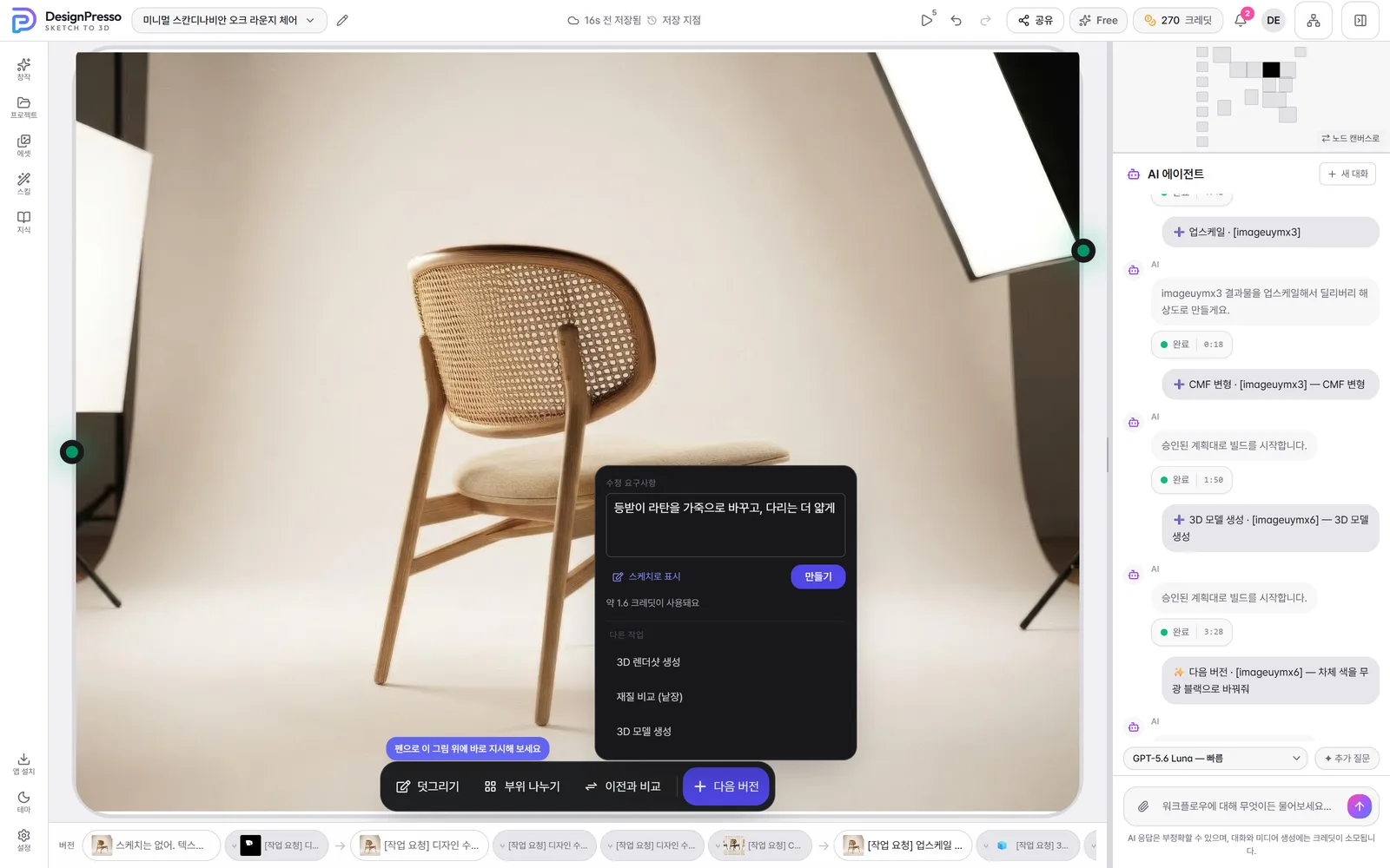
This panel isn't exclusive to Focus view: the [+] button beside any image node on the canvas opens the same 'requirements → Create' flow. Use it when you haven't picked a main design yet, or when the thing you want to work on isn't the main one.
Only a single image of the product can be the main design. A multi-panel comparison sheet, a strokes-only sketch with no background, and a photo you attached as a reference are all rejected with a reason — if any of them became the main, [Next version] would start editing a sheet or a scribble. If you really do want to develop a reference photo, switch its role to 'work on this' in the chat first.
Part-by-part editing
The most common request in product design is "change only this part". Hand that to an image-editing model wholesale and it quietly repaints things you never mentioned. DesignPresso builds a mask for the part you named and regenerates only inside it, so everything else stays pixel-identical.
Change one part
- 1
Pick the image
Click the render node you want to edit so it's selected. With several results on the canvas that removes any ambiguity about which one you mean.
- 2
Name the part and the change
Say one part and what it becomes: "change just the handle to oiled walnut". Write it in whatever language you use — the agent turns it into the English part description the masking step needs.
- 3
The mask and the edit chain up
Two nodes appear on the canvas. The first produces the mask for that part; the second takes the original image together with that mask and regenerates only what's inside it. The original feeds both.
- 4
Check the result
The result arrives as a new image node and the original stays where it was, so if you don't like it you can go back to the original and try again.
What works and what doesn't
- Name one concrete part. Handle, armrest, strap, lid, base, button — a single visible component gives a stable mask.
- Vague pointers like "the top bit" or "somewhere on the left", and names padded with adjectives, make the boundary wobble. Strip it back to the component name.
- Say how the material looks, not just what it's called. "Full-grain leather with visible pebble texture and softened creases" beats "leather" by a wide margin.
- Restyling the whole product into a different tone isn't part editing — ask for a plain full-image edit instead.
- If you want to see several material candidates at once, ask for a material comparison sheet rather than repeating part edits.
Changing more than one part
Part edits run one after another: the handle changes, and the button is then masked on that new image. Branching both from the original in parallel means each one only knows about the original, so the changes don't accumulate and you end up with an image carrying just one of them. Going in sequence takes a little longer and is the only way both land.
An edit produces a new image, and the earlier mask no longer fits it, so the next part gets a fresh mask — masking costs very little, and skimping there just makes the result drift. Note there's still no surface for painting a region by hand or nudging a mask's edge: parts are split by name, and once split you pick them from the badge on the node.
Split once, then keep picking parts
- 1
Press 'Split parts'
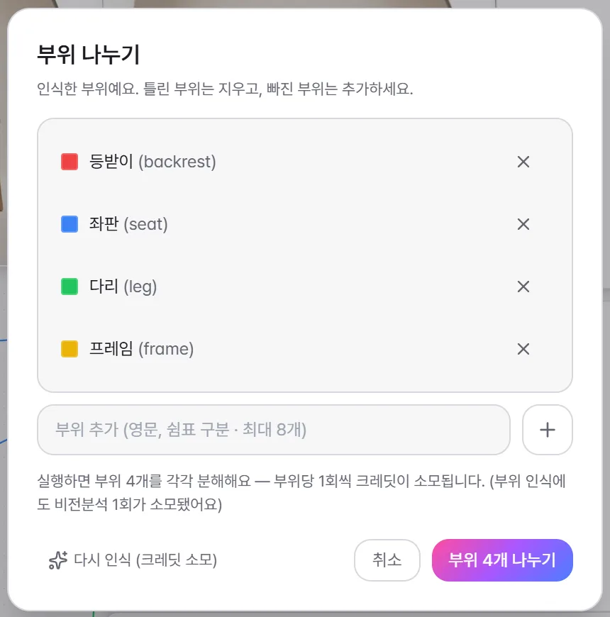
Use the brush icon (Split parts) at the top of an image node that has a result, or [Split parts] in the Focus-view toolbar. The image is read first to work out what's in it, and part candidates come back as a list.
- 2
Check and fix the candidates
The confirmation dialog lists what it recognized — backrest, seat, and so on. Remove wrong ones with ×, and add anything missing by its English name, up to eight. Before it runs, the dialog states how many parts it will split and that each one costs credits — running a wrong list would waste exactly that much, which is why nothing happens until you confirm.
- 3
Pick parts on the node
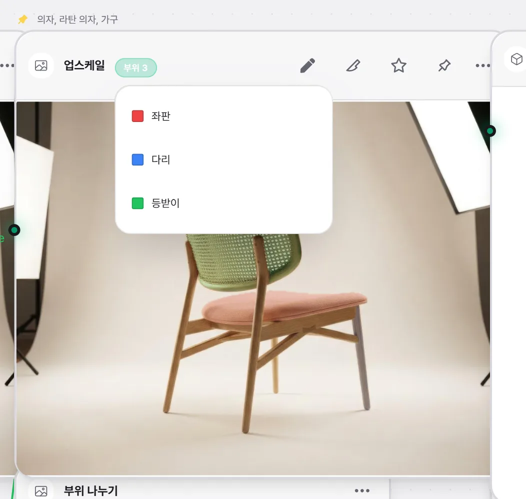
After splitting, a 'N parts' badge sits next to the node title and a light color tint covers each region. Open the badge for the list, or click straight on the image to select whatever part is under the cursor. You can pick several at once.
- 4
Give the instruction with them selected
The chosen parts ride along as chips on the composer: send "change just the material here" and the edit is scoped to exactly those parts, with no retyping. Selecting parts in Focus view and then writing into [Next version] does the same thing — only those regions are repainted. The selection clears once sent.
The node canvas
The canvas is both the record of your work and the workbench. Each node is one generation step, and you build by feeding one node's output into the next node's input. The agent usually does the wiring, but every manual control is there when you want to take over.
Tools in the Create panel
- Input — Text Prompt (a node that just holds wording, no model), Prompt (works your idea up), Describe / Ask (reads an image to caption it or answer a question about it), Image Input (add reference images), and Sketch (draw a starting point straight on the canvas).
- Create — Image: make a new image from text.
- Edit — Compose (combine several images via a prompt), Remove background (cut the subject out onto transparency), and Upscale (raise the resolution).
- Click a card to drop its node on the canvas with it selected, or drag it to the exact spot you want. The search box at the top (⌘K) filters by name and description.
Working it by hand
- 1
Place a node
Click a tool in the Create panel or drag it onto the canvas. Right-clicking empty canvas also opens a node menu.
- 2
Wire nodes together
Drag from one node's output dot to another node's input dot. Colors mark the type — blue is text, green is image. Drag from an output dot onto empty canvas and release to get a menu filtered to compatible nodes, and the one you pick arrives already connected.
- 3
Adjust the settings
Values live in the node itself — write prompts in a text node and wire images into the node that needs them. Skill nodes expand the settings they need inline on the card. There is no separate properties panel.
- 4
Generate
Press Run (▶) in the top bar and every pending or failed node runs in dependency order. The badge on the button shows how many are left — a node you just created is counted there too.
- 5
Use the result
The finished image lives inside its node. If you ran the same node more than once, flip through past results with the 1/N control above it — and every result also collects in the Assets panel's library, where you can download it.
The buttons on an image node
- Pencil — Draw. Mark up that image directly to give direction.
- Brush — Split parts. Builds per-part masks so you can pick regions from the badge.
- ☆ — Include in share. Marks this option as one of the things a share link shows.
- 📌 — Pin as main. Makes this option the main design.
- ⋯ — Duplicate, download, set as thumbnail, delete node. On a 3D node this menu also holds 'Download 3D file'.
- The [+] on the node's right edge — the menu of what to do next; see below.
[+] Add task — choosing what happens next
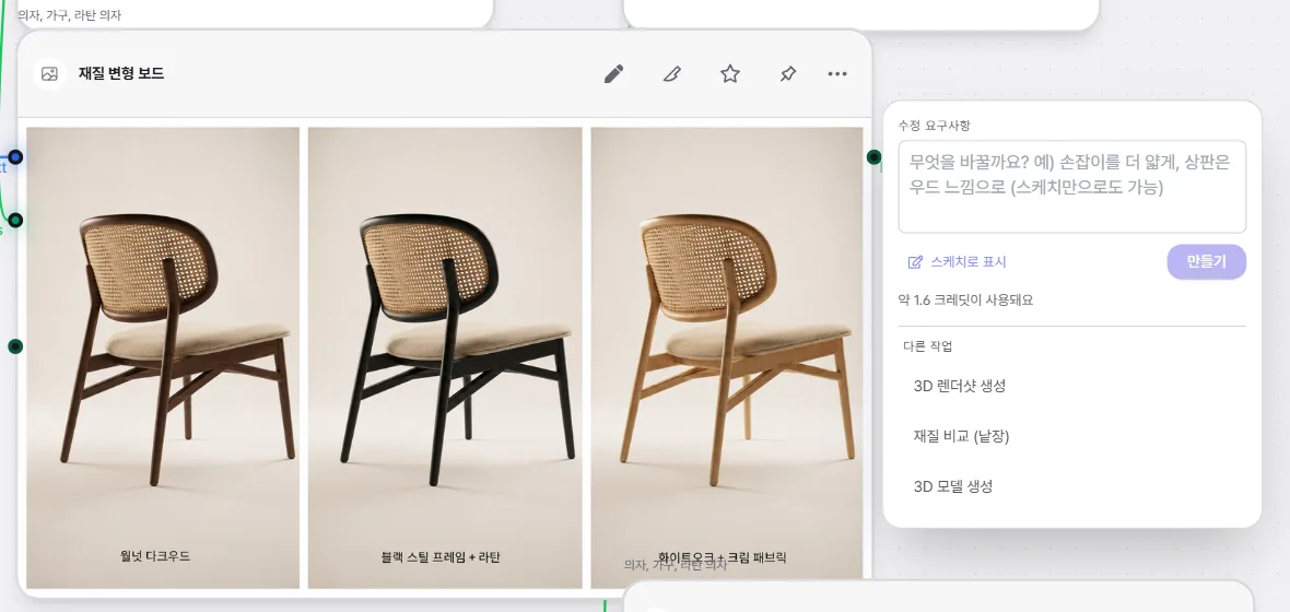
- The top of the panel is 'revision requirements': describe the change, press Create, and you get the next version edited from that image — the same thing [Next version] does in Focus view.
- 'Other tasks' underneath offers Develop sketch, Render shot, Material comparison (separate images), and 3D model. Each opens a small form with just the settings it needs — shot, lighting, background, the material list — and quotes the credits before it runs.
- Anything unavailable right now is dimmed with the reason — "develop into a render first" on a sketch node, "needs a single-product source, not a sheet" on a comparison sheet.
Tidy and organize
- Select two or more nodes to get a group button that wraps them in a named, colored box. Drag a node out of the box and it leaves the group automatically.
- The round toolbar on the left edge: the wand (Optimize layout, shortcut D) re-lays the graph by dependency, the frame button (Fit view, F) fits the view to your selection or the whole graph, and the cursor button (C) toggles between select and hand/pan modes.
- Use the minimap and mouse-wheel zoom to move around a large graph quickly.
**Save points** accumulate as you work. Click the save indicator in the top bar to open the list and hit Bring back — that state becomes the new latest and the page reloads. Note: bringing a save point back can NOT be undone with Ctrl+Z, because the reload clears the undo history. The state you left is kept as a save point too, so use the same list to go back. A canvas shared with you as view-only opens for pan and zoom only, with editing, generating, and save-point controls hidden.
There's no button that runs the whole graph at once. Leave full runs to the agent, or use Run (▶) to re-run just the pending and failed nodes. A node that already holds a result has no generate button, because it is the result — to iterate, add an edit node downstream or ask the agent.
3D models and CAD
Once the form is settled you move from images to 3D. One locked render becomes a 3D model, and from there you can split it into parts or convert it into a CAD (STEP) file for real engineering tools. This is the most expensive and slowest stage in the pipeline, so the cost and a rough duration are always quoted before anything starts.
From an image to a 3D model
- 1
Pick the source image
A clean three-quarter or front render works best. A lifestyle shot turns the background into mesh too, and a multi-panel comparison sheet can't be used as a source at all.
- 2
Run the 3D model task
Choose '3D model' from a node's [+] or from 'other tasks' in [Next version], or just ask the agent for it in the chat. A 3D node appears on the canvas with a progress indicator. It takes minutes, so keep working meanwhile — and if you left the tab, a completion notification finds you.
- 3
Orbit it in the node
When it lands you can orbit the model inside the node, or open it full-screen from the header. Mesh, triangle, material, and bounding-size readouts sit alongside it. With several 3D nodes open, the ones you're actually looking at stay live and the rest drop to static cards until you come back — browsers only allow so many live 3D surfaces at once.
- 4
Download the file
'Download 3D file' in the node's ⋯ menu lets you pick by purpose: GLB (preview and web), FBX (editing, quad mesh), and USDZ (iPhone AR). On an iPhone or iPad, [View in AR] on the full-screen stage places it at real size; if no AR file exists yet you can request one, and the button appears in the same place when it's ready.
The [+] menu on a 3D node
- Split parts — produces a new 3D node decomposed into parts, leaving the original as it was.
- CAD (mesh-based) — rebuilds the current shape as surfaces and writes STEP. It's the fast path and suits surface tools like Rhino.
- CAD (description-based) — an AI rebuilds the part structure into a solid STEP. It suits solid modellers like SolidWorks or Creo, at the price of fine details drifting from the original.
- Items are dimmed with a reason when the 3D hasn't finished yet, or when CAD conversion isn't enabled on this deployment.
Converting to CAD (STEP)
- 1
Choose the approach
In the dialog, pick 'keep the shape (fast)' or 'AI redesign (precise)'. Each option states roughly how many minutes it usually takes.
- 2
Enter the real size
Give the longest edge of the finished piece in millimetres — the longest of width, depth and height, not the height. Common-size presets are offered too.
- 3
Add notes if they help
If you have structural requirements — "keep the four legs cylindrical and the top flat" — write them in. It's optional.
- 4
Convert and check the result
Starting it drops a CAD node on the canvas with elapsed time and a progress bar. When it finishes, [View STEP] shows the shape right in the browser (a preview that approximates the precise surfaces) and [Download STEP] gets you the file. If it fails, the credits are refunded automatically.
Double-check the size
Getting the real size wrong still **succeeds**: it just quietly produces a CAD file several times too big or too small, and you only find out when you open it in your CAD tool. Note also that 'AI redesign' sends your 3D file to an external AI provider — the dialog says so before it runs. Very large STEP files skip the in-browser preview and offer only the download; the file itself is fine.
Skills and Knowledge
A skill is a reusable node you drop on the canvas and run yourself; a knowledge lens is design methodology the agent quietly consults while it decides. Most of the time you just describe what you want and both apply themselves — but you can also toggle, author, and share them.
Skill nodes
Click the wand icon in the rail to open the skills gallery. Cards are split into your own, your team's, and built-in, with a search box at the top to filter by name. The 'in N · out kind' line on each card tells you how many inputs it needs and what it produces. Built-ins include Multi-Angle, which re-renders the same product from a numerically specified viewpoint, and LightBox, which turns a layout of several products arranged at true relative scale into one studio product photograph.
Run a skill on the canvas
- 1
Add the node
Click a card to drop its node on the canvas — a toast confirms — or drag the card and release it exactly where you want it.
- 2
Wire an input
Drag a wire from an upstream node's output into the skill node's left-side input handle. Handles are labeled by role, and a * marks a required input.
- 3
Set the controls
Set the on-node sliders, dropdowns, toggles, numbers, or text fields. A skill with no controls says so — it runs on its inputs alone.
- 4
Run it
Press generate and the result appears as new output node(s) auto-wired to the right. Change a value and press again and the variants fan out sideways instead of overwriting the previous output.
Knowledge lenses
Knowledge lenses are bundles of methodology the agent consults while deciding. Two are on by default and shape how the product behaves: a design-director lens that holds the brief → concept → lock → develop order on new work, and a part-edit lens that routes "change only the …" requests into masked part editing rather than a full regeneration. Beyond those there are lenses for turning form and proportion into concrete visual facts, deciding colorways and CMF, describing how a material actually photographs, directing a render's lighting, background, and camera, judging grip and dimensions on things you hold, reading sketches and marked-up overlays, holding brand consistency across a series, and checking manufacturability.
The book icon labeled Knowledge in the rail opens the lens list. Each row has a name, a short note on when it applies, and a toggle on the right; switching one on applies it account-wide, not just to the current project. There's a cap on how many can be active at once and you'll be told when you hit it. System lenses are locked, so you can only turn them on or off, not edit them.
Make your own
- Custom skill: the '+' button at the top of the Skills panel lets you author one by editing a JSON template (a node manifest is required). It lands under your own skills, and malformed JSON is rejected with a format error. There's no visual builder.
- Custom lens: the New button in the Knowledge tab takes a name, a 'when to use' trigger, a category, and the methodology body. The trigger is what the agent reads to decide whether to apply it, so keep it to one or two clear sentences.
- Team share: if you're on a team, the share icon on your own skill or lens card pushes it to everyone's panel, with unshare and delete in the same spot. These controls appear only when you actually belong to a team.
Skill nodes are skipped by the top-bar Run (▶) — they only fire from their own generate button. A skill also holds no output of its own: each run spins up fresh output nodes to the right, so you can nudge a value and run again to fan variants out side by side without ever overwriting an existing image. If a required input isn't wired, a toast tells you what to connect first.
Projects and assets
Once canvases pile up and results multiply you need somewhere to put them. The Projects panel handles canvases; the Assets panel handles generated results and uploads.
The Projects panel
- Click a name in the list to switch canvases, and use the search box at the top to filter by name.
- Canvases you own can be renamed inline or deleted, with a confirmation step before deletion.
- Folders are a single flat level for tidying up: create one, drag a canvas onto its header to file it, and drag it to the 'no folder' area to take it back out.
- If you have a team, a canvas you own can be moved into the team space so every member can co-edit it — and moved back to personal just as easily.
- 'New canvas' at the foot opens the same dialog as the top bar.
The two Assets tabs
- Library — where generated results collect. A toggle at the top switches between this canvas and everything in your account, with a team scope too on team canvases. Download or delete straight from a tile.
- Uploads — everything you brought in through the chat or an input node.
- Library and Uploads each have a search box at the top, and the grid loads more as you scroll so a long history doesn't dump itself all at once.
Getting a finished image out means downloading it: use the download button on a tile in Assets › Library, or open the result large and save it. Anything you make on the canvas is kept in the library automatically, so there's nothing extra to save.
Settings is where you change your profile and language, review this month's usage, and download your account data as JSON. Deleting your account, at the bottom of the same screen, permanently removes the account and everything in it — projects, generated media, and any remaining credits — and cannot be undone. Cancel an active subscription in Billing first.
Collaboration and sharing
Open a canvas with a public link or invite people by email to edit together in real time. You can also see who's looking at it right now and catch up on what happened while you were away.
The owner of a canvas can share it two ways from the Share button in the top bar: switch on a read-only public link anyone can open without an account, or invite specific people by email as Viewers (read-only) or Editors (full co-editing).
Share and co-edit
- 1
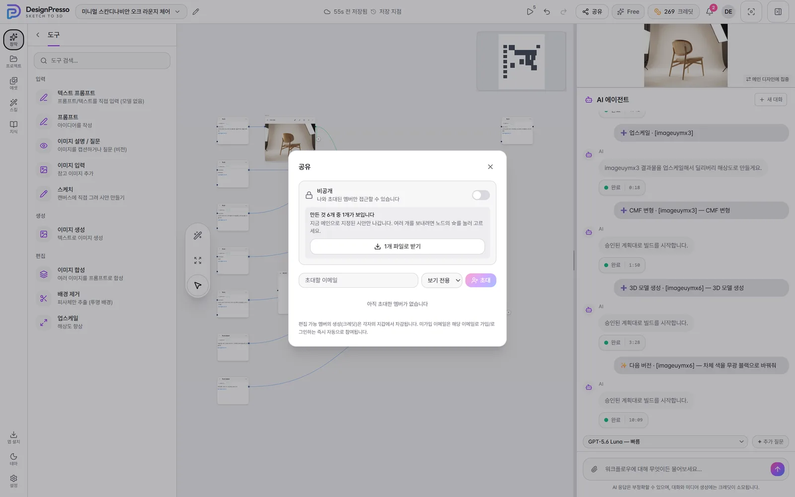
Open the Share dialog
Click Share at the top right. It only appears if you're the owner, and its icon turns green while the canvas is public.
- 2
Check what will be visible
The middle of the dialog says "M of N things you made are visible". By default that's just the pinned main design; if you've marked options with ☆ on their nodes, only those go out; and with nothing marked, it sends the finished results minus intermediate sketches and comparison sheets. Reading that one line before you send is enough to keep studies from going out by accident.
- 3
Turn on a public link
Flip the public-link toggle at the top of the dialog and a copy button appears. Copy the link and pass it on yourself; whoever opens it gets a read-only view with no login. Flip it back off to unpublish.
- 4
Invite people by email
Type the person's email in the invite row, pick Viewer or Editor, and click Invite. If they already have an account they join at once; if not, the invite waits as pending and they join automatically the moment they sign up or log in with that address.
- 5
Manage members
Invited members are listed with their email. Use the role dropdown on their row to switch between Viewer and Editor, and the trash icon to remove them instantly.
- 6
Co-edit in real time
When an invitee opens the same canvas you work on it together. Editors get the graph, generation, and the agent just like the owner; Viewers get a fully read-only studio and watch changes stream in live.
What each role can do
- Owner — the only one who can publish, invite, rename, and change roles. The Share button and the rename pencil show only to them.
- Editor — edits and generates like the owner, but generation credits come out of their own wallet. Renaming the canvas stays owner-only.
- Viewer — the whole studio is read-only. A read-only badge sits next to the canvas title, and editing, generating, and typing to the agent are all locked.
Canvas-share invites do not send an email — copy the public link or pass the canvas address along yourself. (Team console invites are different: those really do send mail.) The 'download N files' button in the same dialog grabs exactly the images the share would show, in one action, with Korean filenames preserved.
Presence and notifications
- Who's viewing — anyone else with the canvas open stacks up as a colored avatar in the top bar. Hover to expand the list; nothing shows when you're alone.
- Live cursors — while co-editing, each person's pointer shows on the canvas as a colored arrow with a name tag. There's nothing to switch on.
- Notification bell — the bell at the top right collects what happened while you were away, such as canvas invites and finished or failed generations. Click an item to mark it read and jump to that canvas.
Team workspace
If you own or administer a team workspace, a Team item appears at the bottom of the left rail. The team console has four tabs — Members, Credits, Billing, and Settings — covering members and seats, the shared credit pool, the plan, and team settings. Move a canvas you own into the team space from the Projects panel and everyone on the team can co-edit it.
A few things to watch: Viewers receive canvas changes live but see the agent chat as a static view. Removing a member is immediate and retroactive — they instantly lose access even to what they previously made on that canvas. Teams are one per person, so if you already belong to one you have to leave it before accepting another invite.
Credits and billing
The Billing page is the one place to manage your credit balance and payments. Credits are spent whenever you generate or edit an image, and you refill with a one-time top-up or a monthly/annual subscription.
Your balance sits in the credits card at the top of the page. You never set a per-job price — each generation deducts what it actually used — so you track spending by watching the balance and reading the recent-credit-history table at the bottom. Note that a one-time top-up gives 17–21 credits per $1 depending on the amount while spending happens at real cost, so the buy rate and the spend rate differ. All charges run through Stripe in US dollars.
Buy one-time credits
- 1
Pick an amount
In the top-up section, tap a quick-pick chip or drag the slider to set an amount (minimum $50, maximum $600).
- 2
Check the live summary
The panel live-updates the credits you'll receive, the per-dollar rate, any volume-discount badge, and a hint of how much more would get you a better rate. Bigger amounts give more credits per dollar.
- 3
Pay
The pay button opens a confirmation showing the credits granted, the total, and the refund policy. Review it and continue to Stripe Checkout.
Subscription plans
- Use the annual/monthly toggle in the subscription section. Annual is preselected and carries a discount badge; picking it shows the effective monthly price (annual fee ÷ 12) on each card with the original monthly price struck through.
- Each card — Starter, Pro, Studio — shows monthly credits, price, a rough estimate of how much you can generate, and the concurrent-generation limit (4/8/12). Click subscribe, confirm the auto-renewal notice, and continue to payment. Going over the concurrency limit doesn't fail; extra requests simply queue.
- While subscribed, upgrading to a higher card applies instantly with a prorated charge and matching credits; downgrading takes effect at the next renewal with nothing charged now. Cancelling ends access at period end, and if a cancellation is already scheduled you can resume instantly.
- Manage invoices & payment method opens the Stripe customer portal to view invoices and update your card — available once you have a prior payment. Where organization plans are enabled, an individual/organization toggle switches to Education, Team, and Enterprise (Team needs a 3-seat minimum; Education requires institution approval).
More ways to top up and save
- If you've never topped up, the card shows a first-top-up badge and your first paid top-up automatically grants double the base credits — once per account.
- Under auto-refill, click Manage to set the refill amount, threshold, and monthly cap, tick the consent box, and save; when the balance drops below the threshold your saved card is charged automatically. You can switch it off anytime.
- In the coupon section, enter a code and click redeem or press Enter to add the credits and refresh your balance.
The recent-credit-history table lists date, description, and change for up to 20 grouped rows, collapsing repeats. For the full record, use the 30-day or 90-day buttons to download a CSV. If expiry applies to your account, a note under the top-up section explains that top-up credits last 90 days and subscription credits 30, with the soonest-to-expire always spent first.
Refunds cover unused credits only, within 7 days of purchase; credits you've already spent are non-refundable. Auto top-up is available only to subscribers with a saved card, and the save button stays disabled until you tick the consent box. An admin-granted tier badge means an operator gave you access only — it isn't a paid subscription and carries no monthly credits. Everything is charged in USD via Stripe, so your card issuer may add its own exchange rate or fees.
FAQ
Can I change one part without regenerating the whole product?
Yes — it's the core of the product. Name one part ("make just the handle oiled walnut") and DesignPresso builds a mask for it and regenerates only inside that mask, leaving everything else pixel-identical. For several parts, go one after another rather than all at once: branching them in parallel means the changes don't accumulate.
Which model runs my request, and can I choose it?
There is no picker for the model that draws your images. You say what you want and the server routes it — turning a sketch into a render, masking a part, and drawing a CMF board all need different handling, and choosing between them is the product's job, not yours. If you want a different result, sharpening how you describe the request does far more than swapping models would. The selector above the chat composer is not a generation model: it sets **how hard the agent thinks** (fast / balanced / deep reasoning).
What is the 'main design', and do I have to set one?
It's the marker (📌 on a node) that pins down which image is the product right now. You rarely set it by hand: your first result is pinned automatically, and the pin then follows any new result built from it. Having a main design is what unlocks 'Focus the main design' in the top bar — and that's where the product's core loop lives, marking up the image with a pen to get the next version. You only move it yourself when you want to walk a branch back.
Can I get a 3D model or a CAD file out of it?
Yes. A locked render becomes a 3D model, and the node's ⋯ menu downloads it as GLB (preview and web), FBX (editing), or USDZ (iPhone AR). The [+] menu on a 3D node can split it into parts or convert it to CAD (STEP), where you choose between 'keep the shape (fast)' and 'AI redesign (precise)'. When converting, give the finished piece's longest edge in millimetres accurately — a wrong value still converts, it just hands you a file at the wrong scale.
When are credits used, and how do I refill them?
Credits are spent every time you generate or edit an image, and the agent doing it for you bills exactly the same as a manual click. Refill on the Billing page with a one-time top-up or a monthly/annual subscription.
If a generation fails, do I lose the credits?
No — failed generations are refunded automatically, and transient provider errors are retried a few times on their own. If a node shows a failure message, read it and re-run.
Can I review a plan before anything runs?
Yes. An instruction normally builds immediately, but say "show me the plan first" and the agent posts a plan card with what it will make and the estimated credits, plus yes / modify / stop choices — nothing that costs credits starts until you confirm.
How do I keep it looking like the same product across shots?
Lock the chosen concept into one sentence covering color, material, finish, and signature form. The agent re-inserts that sentence verbatim into every later prompt and builds new shots from the locked render as the source. When you're shooting a series, hold the camera and lighting wording steady as well, and change only one variable at a time.
Can I start without a sketch?
Yes. Describe the product you want and the agent checks a short brief, then proposes two or three genuinely different concepts; pick one and it develops from there into angles, materials, and sheets. If you do have a sketch, upload it in the chat and ask for a render — and in that case don't re-describe the form in words, just the material, finish, lighting, and background.
Can I use it on a tablet or phone?
On a phone you get a chat-first mobile view: talk direction through with the agent and review what you've made. On a tablet the full studio opens — and an iPad with a pen is arguably the posture this product was designed around: marking up the image directly in Focus view is the core loop, and the toolbar sits low where your hand already is. 'Install app' in the rail puts it on the home screen so it runs without browser chrome. Laying out and wiring lots of nodes is still more comfortable on a wide desktop screen.
How do I get my finished images out?
Everything you make on the canvas collects automatically in Assets › Library. Use the download button on a tile, or open the result large and save it. For several at once, mark the ones you want with ☆ on their nodes and use 'download N files' in the Share dialog. For 3D, '3D file download' in the node's ⋯ menu offers GLB, FBX, and USDZ by purpose. There's no separate export step.
How do I share a canvas to work with someone?
Open the canvas with a public link or invite people by email to edit together in real time; you can also see who's viewing and catch up on what changed while you were away. Edit rights are set per invite as Viewer or Editor. No invitation email is sent, so pass the link or address along yourself.